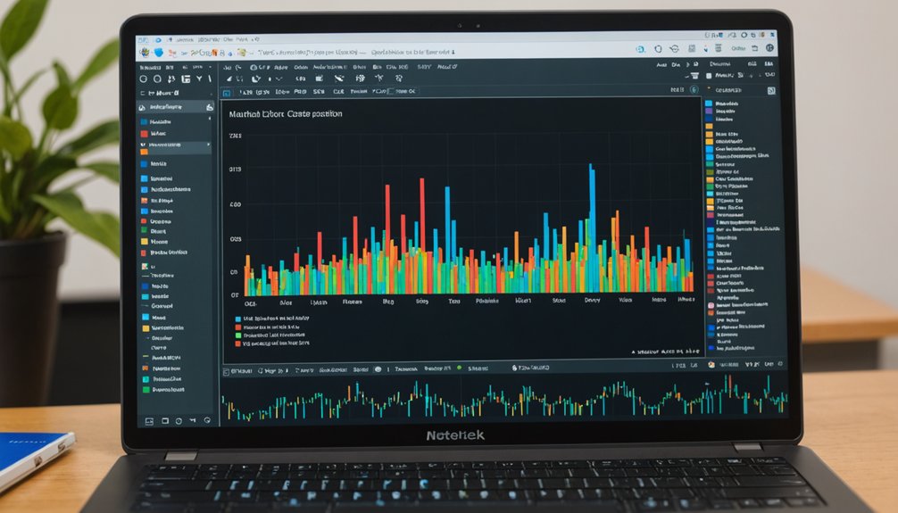
Matplotlib transforms boring data into eye-catching visuals with minimal effort. Install it using 'pip install matplotlib', then import with 'import matplotlib.pyplot as plt'. It works seamlessly with numpy and pandas. Create line plots for trends, bar charts for comparisons, or scatter plots for relationships—all through straightforward code. Advanced users can build complex subplots and 3D visualizations. Export options include PNG, PDF, and SVG formats. The right visualization might just reveal patterns you've been missing all along.

Matplotlib transforms raw numbers into visual stories. This powerful Python library has become the go-to tool for data scientists who need to make sense of complex information. It's not just about pretty pictures—it's about revealing patterns hidden in data. The library supports various plot types: line, bar, scatter. Basic stuff, really. But it works.
Getting started with Matplotlib isn't complicated. A similar approach to model preprocessing helps prepare your data for effective visualization. A simple 'pip install matplotlib' does the trick. Most users import it with 'import matplotlib.pyplot as plt'—shorter names mean less typing. Nobody has time for verbosity these days. Matplotlib plays well with numpy and pandas, creating a robust ecosystem for data work.
Line plots show trends over time. Bar plots compare categories. Scatter plots reveal relationships between variables. Pick your visualization weapon based on your data story. Sometimes the simplest visualization delivers the strongest message. Many data scientists use scatter plots to visualize principal components analysis results when reducing high-dimensional data.
Want multiple visualizations? Subplots let you create several charts in one figure. It's like having multiple TV channels on one screen. Data analysts love this feature—it saves space and helps with comparisons. The plt.subplots() function creates a figure and axes for organizing multiple visualizations in customizable layouts.
Customization options abound. Colors, labels, titles—they're all adjustable. The default styles are functional but boring. A few tweaks can transform a mediocre plot into something worth showing off. Adding trend lines to scatter plots can help clarify the linear relationships between variables.
Matplotlib isn't limited to static images. It handles 3D plots for complex data and even supports animations. Yes, your charts can move. Impressive, right?
When you're done creating your masterpiece, export options give you flexibility. Share your work however you want—PDF, PNG, SVG. It really doesn't matter.
The community around Matplotlib provides plenty of support. Stuck on a visualization problem? Someone's probably solved it already.
Data visualization isn't optional anymore. It's a fundamental skill. Matplotlib makes this skill accessible to Python users regardless of their experience level. Raw data is just numbers. Visualized data tells stories. And stories get remembered.
Frequently Asked Questions
How Do I Change the Color of Individual Data Points?
To change individual data point colors in Matplotlib, programmers can use the 'c' parameter in scatter plots. It accepts color arrays matching each point.
There's flexibility here. Use color names, hex codes, RGB values—whatever works. For extra flair, colormaps map numerical values to color ranges.
Simple example: plt.scatter(x, y, c=['red','blue','green']).
Transparency? That's the 'alpha' parameter's job. Pretty straightforward stuff.
Can I Create Interactive Plots With Matplotlib?
Yes, Matplotlib can create interactive plots. Users need special backends like '%matplotlib notebook' or '%matplotlib ipympl' in Jupyter.
Libraries such as 'mpl_interactions' and 'ipywidgets' add sliders, buttons, and other controls. Event handling captures clicks and hovers. It's not Plotly-level fancy, but gets the job done.
Real-time updates? Absolutely possible. Data exploration becomes less static, more dynamic.
How to Overlay Multiple Plots With Different Y-Axes?
Multiple plots with different y-axes can be overlaid using the twin axes method. Create a primary plot, then add a secondary y-axis with 'ax.twinx()'.
Each axis gets its own data, color scheme, and limits. Customize with different colors for each axis's labels and tick marks.
For clarity, add a legend and adjust line styles. Works great for comparing datasets with different scales. Simple, but effective visualization technique.
What's the Best Way to Save High-Resolution Figures?
For high-resolution figures, save them with higher DPI settings.
Default DPI? Too low for quality printing. Use plt.savefig('figure.png', dpi=300) for publication-ready images.
Vector formats like SVG and PDF are better though—they scale without losing quality. No pixelation ever.
File size increases with DPI, but that's the price of clarity. For digital display, vector formats. For printing? High DPI. Simple as that.
How Do I Create Animations From Matplotlib Visualizations?
Creating animations in Matplotlib requires the animation module. Start by importing matplotlib.animation and numpy.
Set up a figure, then use FuncAnimation with a custom animate function that updates each frame. Save results with ani.save() – GIFs need PillowWriter, MP4s need FFmpeg installed.
Animations bring data to life. Customize with different speeds, colors, and text annotations for maximum impact. It's surprisingly straightforward.


